
Miranda Writes Logo Entry
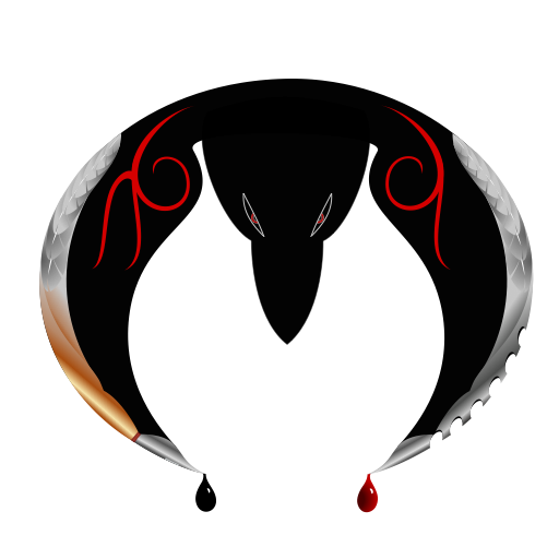
This is my entry for Docsaico's logo contest, done in Inkpad for the iPad. It came out more complicated than anticipated. I do not recommend learning a program on a deadline; it took damn near forever - forever being almost two weeks. I'd had a bit of experience in GIMP and Inkscape before, but I was never inclined to finish anything, so my skills were definitely limited. Now I'm really tired. Time to get to bed, and maybe tomorrow life will return to normal and I can continue work on that Fringe post I've been promising for weeks.
Just checking something here for a minute. Trying to get a larger picture that doesn't blur. Hmm, I uploaded to PhotoBucket and it came out full size. Interesting. This way the black logo can also load over a background other than black.

And here's another version, more like what you would need for a smaller picture with less detail and cleaner lines. I removed the extra color from the calligraphy pen on the left wing to match the silver of the blade on the right, removed the feathers from both wings, and changed the eyes to pure white. This one is closer to an actual logo, while the other is intended to be a larger graphic. I might eventually do one that's further simplified.


Awesome! Love it. Great work.
ReplyDeleteThank you! :D It was a lot of fun...and a buttload of work. It was the first anything I ever finished in a vector program I had only recently started learning.
ReplyDelete