Okay, so I lied. I said I wouldn't do another drawing for the Coulson Lives Project. Two days later I started this one. It was drawn in Inkpad and shaded in Art Studio, both for the iPad. I spent over a week on this, constantly going back over bits I'm not quite happy with. I'm currently obsessed with Avengersand learning these art programs. It takes up a lot of time, which I need for other obsessions. I'm mired in this one right now because I love the character and believe the right writer(s) could bring him back in a sequel in an emotional way that wouldn't lessen the impact of his apparent death.
This heart isn't just for Coulson but for the whole team. At first I was going to use all superhero personas, but that didn't fit well and I like real names better. I was going to use all last names, because it all started using "Coulson Lives," but that didn't fit either and was too impersonal. Then I did a mix and I ran into the same problem. Finally, first names worked. I would have liked to use "Phil," but I have to keep "Coulson" for the project.
I could have said "Hulk Smashes," but who hasn't heard that a million times? I almost said "Thor Hammers," but no kidding...and that sounds odd. Originally I had "Barton Snaps," because he does some snap shooting (firing without aiming). I thought it might also work for his change of heart regarding Loki, but that doesn't really apply since it was mind control and not cracking under pressure. "Swagger" works better here since he's quite confident in his abilities. There is a lot more to Natasha than glaring, but she does it well and "kicks ass" is more than one word. Also, I already had Thor pummeling and Bruce brawling. I needed something different. Of course, Steve assumed the role of their leader in the end, so that one never changed. The first and last piece of the puzzle was Tony. I had from the beginning "Tony Snarks," you know, because he's snarky. But that just didn't sit right with me because it seems that's not a form of the word, though it should be. So, I chose "Sparks" not only because he grates against everyone, but because he's fired up when Captain America questions his motives and basically his heart.
Alrighty, that's enough of that. Time to get back to hookblading the hapless guards in Assassin's Creed:Revelations.
Just my little contribution to #CoulsonLives. Oh my God, is it really finished? It damn well better be or I'm going to cry and have a fit. I spent entirely too long on this, too many late nights. I almost can't believe I'm done...and contemplating another. Won't happen, but I'd like it to.
Does it look like I went overboard with the message? Maybe. That's because I couldn't stick with a decision. There was a lot of fooling around with Bezier curves, colors, gradients, anchor points, et cetera, to get things exactly right. And then I changed my mind...and changed it again. I give you them all at once, because I don't have time to make three different "cards." Then I would be very tempted to play around, change the background over and over, maybe attempt a character, and I'd probably quit half way through.
I actually had more than a few ideas. If only I remembered how to draw, I could have done what I wanted originally. Coulson's face in comic book form might have played a part. I'm envying all those wonderful people with drawing skills who have already contributed and those who are just doing it for themselves, especially the ones behind these beauties:
Okay, back to me. They're in order of first to last idea, even though the first was the last to be finished and the third uses the second's unmodified lettering. And don't even get me started on that. I made two completely different sets of letters for this. Don't know why. It almost made me nuts. I definitely have respect for font designers. It can take years to design a complete font. Took me three weeks just to come up with a few decent glyphs. Why didn't I just use an Avengers-type font? I like it, but I was already working on my own before I thought of it.
Boy, this would have been so much quicker to draw in sand. Why didn't I? Because a few people have already. And seeing as I don't have sand, that probably wouldn't work. I would love to be more efficient, but I'm new to vectors. Only completed a couple little things. Looks like it will be a while. Hopefully, I'll keep at it...maybe with program other than Inkpad. After a while, I guess if there are too many objects (both visible and hidden), there will be ghosts you can't delete, paths you can't separate, objects that suddenly multiply when you're trying to get rid of them, and crashes that make it impossible to undo the last thing it screwed up. Though, I can make a decent enough whatchamacallit here, I'm thinking about getting iDraw since Inkpad hasn't been updated in forever and is seriously limited and starting to be frustrating.
Just realized I've been making videos 560px wide and pictures 600px wide. What the...? Why is this happening? And which will I choose? Decisions, decisions. I'll probably waffle back and forth and never settle on one.
Yup, a completely useless post...or is it?
For your PC
GIMP - To edit your own pictures or make something from scratch.
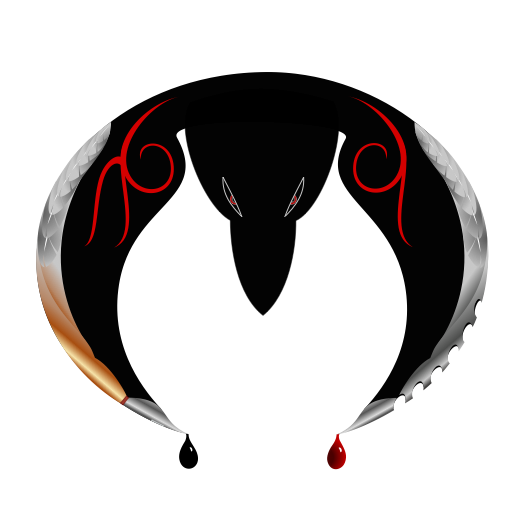
I finished my own logo! Yay! Okay, enough being excited. I've wanted one for years, but I never took the time. This logo is absolutely nothing like the one I originally wanted. That's because I didn't use even a bit of that idea. It was more complicated and I'm just learning my vector app (yes, still, all these *months later), so I went for something easier. Or so I thought. I worked on it for weeks. Partly because I don't know what I'm doing, partly because I didn't have a lot of extra free time, but mostly because I just wanted to do something else whenever I wasn't working (e.g. video games, reading, drawing weapons, TV). Eventually, I think I'll refine it, when I use a more precise program. At the same time I was working on a little #CoulsonLives project, which is almost done. It just needs a few adjustments. Watch out for it here in the next few days...hopefully. I'll explain that "hopefully" later.
This is my entry for Docsaico'slogo contest, done in Inkpad for the iPad. It came out more complicated than anticipated. I do not recommend learning a program on a deadline; it took damn near forever - forever being almost two weeks. I'd had a bit of experience in GIMP and Inkscape before, but I was never inclined to finish anything, so my skills were definitely limited. Now I'm really tired. Time to get to bed, and maybe tomorrow life will return to normal and I can continue work on that Fringe post I've been promising for weeks.
Just checking something here for a minute. Trying to get a larger picture that doesn't blur. Hmm, I uploaded to PhotoBucket and it came out full size. Interesting. This way the black logo can also load over a background other than black.
And here's another version, more like what you would need for a smaller picture with less detail and cleaner lines. I removed the extra color from the calligraphy pen on the left wing to match the silver of the blade on the right, removed the feathers from both wings, and changed the eyes to pure white. This one is closer to an actual logo, while the other is intended to be a larger graphic. I might eventually do one that's further simplified.
Until the series ends, I'll always be behind adding to this playlist. I had to stop for quite a while, so there's a big gap. Still, there are 170 songs to enjoy.
This is the essence of The Blacklist. Probably my favorite is Disturbed's cover of "Sound of Silence." The scene it played over was one of the most devastating ever in the series.