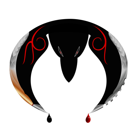
I finished my own logo! Yay! Okay, enough being excited. I've wanted one for years, but I never took the time. This logo is absolutely nothing like the one I originally wanted. That's because I didn't use even a bit of that idea. It was more complicated and I'm just learning my vector app (yes, still, all these *months later), so I went for something easier. Or so I thought. I worked on it for weeks. Partly because I don't know what I'm doing, partly because I didn't have a lot of extra free time, but mostly because I just wanted to do something else whenever I wasn't working (e.g. video games, reading, drawing weapons, TV). Eventually, I think I'll refine it, when I use a more precise program. At the same time I was working on a little #CoulsonLives project, which is almost done. It just needs a few adjustments. Watch out for it here in the next few days...hopefully. I'll explain that "hopefully" later.
This is my entry for Docsaico'slogo contest, done in Inkpad for the iPad. It came out more complicated than anticipated. I do not recommend learning a program on a deadline; it took damn near forever - forever being almost two weeks. I'd had a bit of experience in GIMP and Inkscape before, but I was never inclined to finish anything, so my skills were definitely limited. Now I'm really tired. Time to get to bed, and maybe tomorrow life will return to normal and I can continue work on that Fringe post I've been promising for weeks.
Just checking something here for a minute. Trying to get a larger picture that doesn't blur. Hmm, I uploaded to PhotoBucket and it came out full size. Interesting. This way the black logo can also load over a background other than black.
And here's another version, more like what you would need for a smaller picture with less detail and cleaner lines. I removed the extra color from the calligraphy pen on the left wing to match the silver of the blade on the right, removed the feathers from both wings, and changed the eyes to pure white. This one is closer to an actual logo, while the other is intended to be a larger graphic. I might eventually do one that's further simplified.
Until the series ends, I'll always be behind adding to this playlist. I had to stop for quite a while, so there's a big gap. Still, there are 170 songs to enjoy.
This is the essence of The Blacklist. Probably my favorite is Disturbed's cover of "Sound of Silence." The scene it played over was one of the most devastating ever in the series.